DISRUPTIVE TYPE
Create an experimental typographic composition that is disruptive. The goal is to generate a ripple, question the status quo, and/or ask better questions.
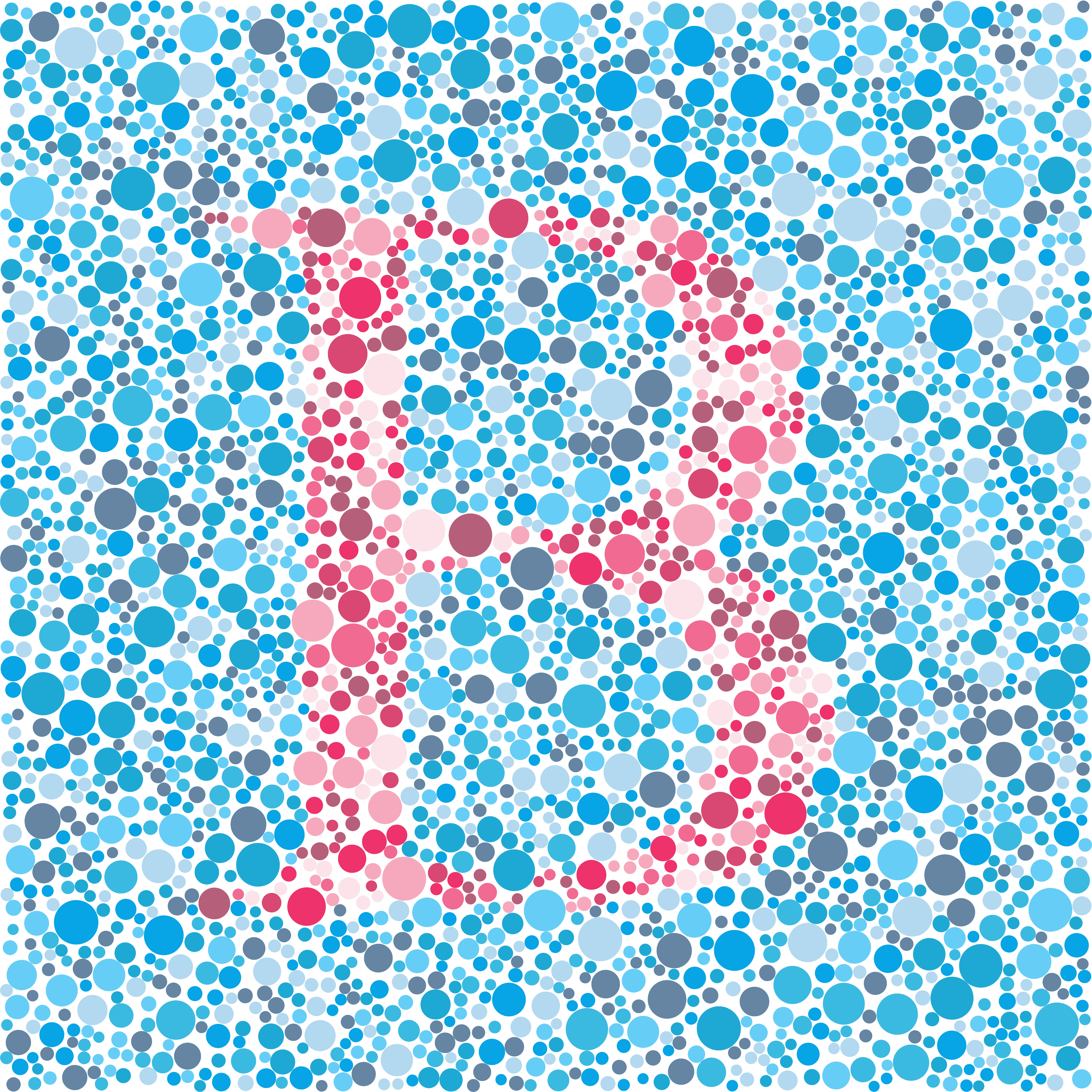
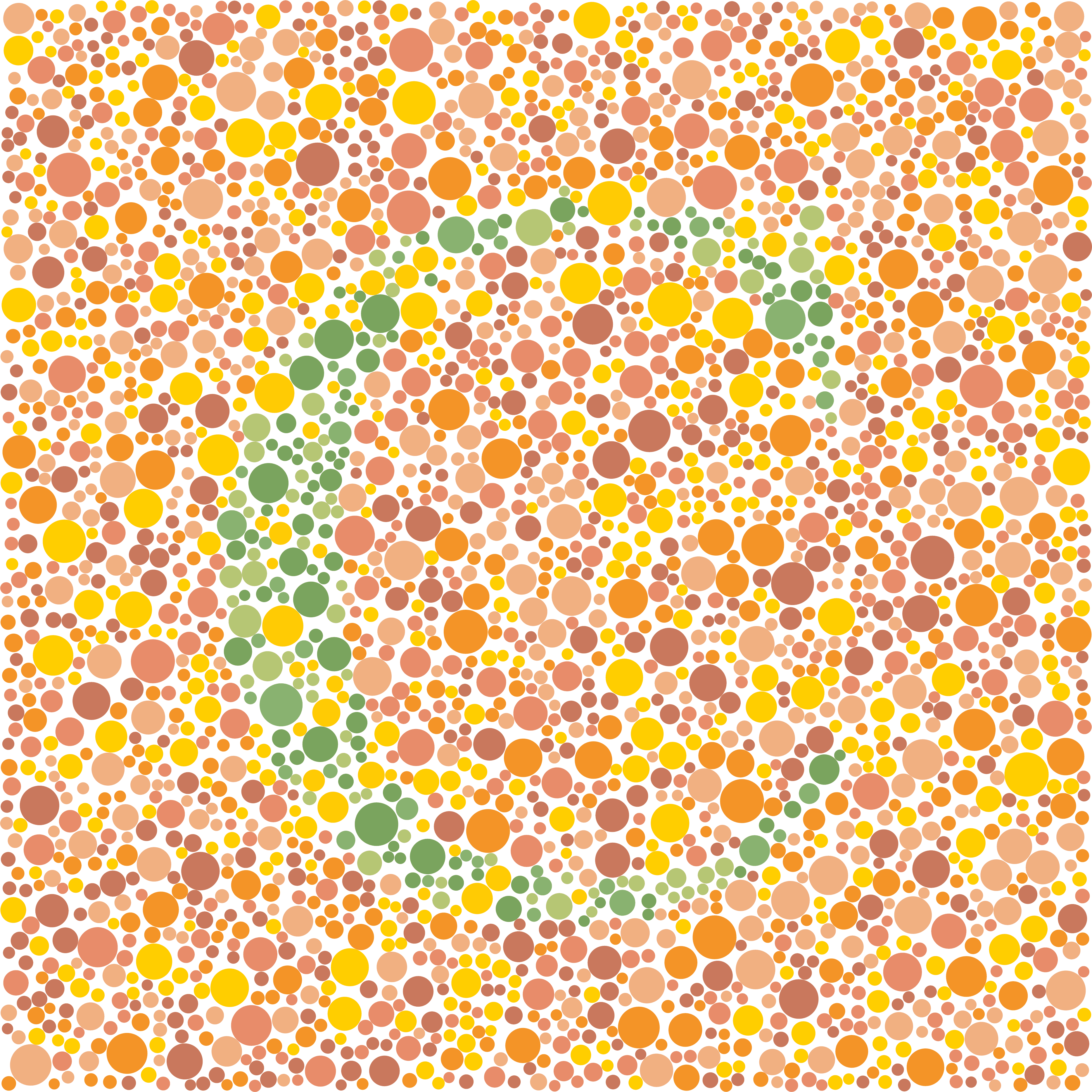
I implemented a variety of colour combinations in the form of ishihara plates to cover protanopia, deuteranopia, and tritanopia. I tried my best to understand what it means to be colour vision deficient in today's world. I questioned what the accessibility gap felt like in the design industry. What tools do we have, or need, to close the gap? What can't we see?
I decided to create a composition of Latin script since it is at the foundation of global communication. Each plate is split in half, but not all are legible for those with the corresponding deficiency.
In this composition I use metaphor to bring an awareness to how not everyone will receive a complete message. Accessibility gaps in design disrupt visual communication fluency.
Brief
Methods
Outcome